The Architecture of Enterprise Applications
Partnering with a premium SaaS dashboard UI UX design agency is a fundamental requirement for building a successful Software as a Service platform. A software product can possess the most powerful backend architecture and groundbreaking features, yet fail entirely in the market if the administrative interface is chaotic.
When an application scales to include complex analytics modules, extensive user management systems, and live data streams, standard web design practices completely break down. The way data is visualised, categorised, and interacted with directly dictates user retention, operational efficiency, and ultimately, the profitability of the software.
Why You Need a SaaS Dashboard UI UX Design Agency
When you are developing digital products at a massive scale, partnering with a specialised SaaS dashboard UI UX design agency shifts from being an aesthetic luxury to a core engineering requirement. An expert agency understands that designing for software is fundamentally different to designing a standard brochure website.
By hiring a dedicated SaaS dashboard UI UX design agency, you are investing in specialised cognitive formatting. The primary goal is to engineer a seamless flow of information that reduces the cognitive load on your users. If your clients have to spend hours learning how to pull a simple report from your software, they will eventually cancel their subscription and move to a competitor with a more intuitive platform.
The True Cost of Cluttered Visual Architecture
Many enterprise platforms suffer from a severely cluttered layout design, which complicates user onboarding and dramatically reduces retention. When data visualisation is poorly executed, users experience immediate cognitive overload. Important insights get buried under excessive, useless visual elements, leading to massive operational friction.
Premium interface design rigorously prioritises clarity over decoration. A professional, minimalist layout strips away unnecessary visual noise, ensuring that every single pixel on the screen serves a logical, strategic purpose. According to usability research by organisations like the Nielsen Norman Group, intuitive navigation and clear visual hierarchies are the leading factors in digital product satisfaction. By implementing clean spacing, strict grid systems, and clear typographic hierarchies, a complex multi-page dashboard can be transformed into an intuitive, high-performance workspace that users actually enjoy logging into every single day.
Core Principles of Premium Dashboard Design
Designing an elite SaaS interface requires a delicate, highly technical balance of spatial awareness, data architecture, and intuitive interaction design. It is not merely about making a screen look modern; it is about engineering productivity.
Progressive disclosure is a foundational principle we heavily employ. Users do not need to see every single data point at the exact same time. Elite UI/UX design presents only the vital, top-level information on the primary viewport, while keeping deep-dive data accessible via intuitive interactions or clean, multi-layered menus. This approach keeps the primary dashboard looking incredibly clean while maintaining the full operational power required by your most advanced power users.
Furthermore, a large-scale admin panel requires immense modular flexibility. Building interfaces with this mindset ensures that data components, interactive tables, and navigation sidebars scale smoothly across various screen sizes while maintaining flawless performance.
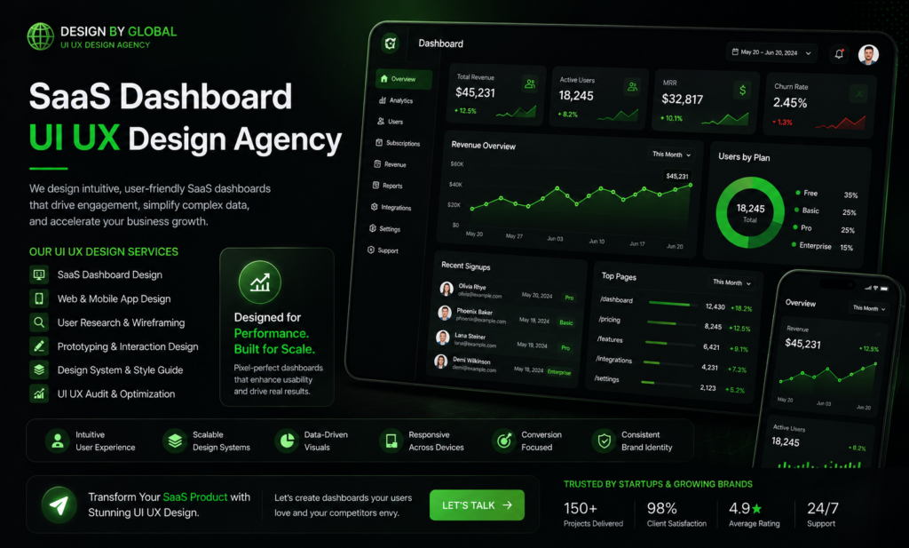
The Strategic Power of a Dark-Themed Aesthetic
In professional digital products, colour choices must be highly strategic rather than purely decorative. We strongly advocate for modern, dark-themed designs when constructing complex dashboards. Dark layouts significantly reduce eye strain during prolonged, hours-long sessions, making them highly popular and practically essential for data-heavy applications, developer tools, and advanced analytics platforms.
When a sleek, minimalist dark theme is paired with highly specific, high-contrast accent colours, it creates an instantly recognisable visual grammar for the user. For instance, utilising a vibrant neon green accent draws immediate, undeniable focus to positive growth metrics, successful transactions, or key performance indicators. Conversely, deploying deep red accents reserved exclusively for critical alerts ensures that users never miss a vital notification. This precise colour psychology positions your software as a premium, high-end asset.
Seamless Integration with Modern Technical Stacks
A beautiful design is completely useless if it cannot be seamlessly translated into robust code. The most successful SaaS platforms bridge the gap between high-end UI/UX and flawless frontend development. A premium interface must be built in perfect harmony with modern web technologies.
Utilising utility-first frameworks like Tailwind CSS ensures that the precise, minimalist designs are translated into lightweight, exceptionally fast frontend code. Whether the backend logic is powered by bespoke PHP, robust MERN stack applications, or highly customised WordPress architectures, the frontend UI must remain lightning-fast. Clean code architecture means the interface loads instantly, responding to user inputs without a millisecond of delay.
Design By Global: Your Partner in Elite Development Services
At Design By Global, we operate as a leading SaaS dashboard UI UX design agency and comprehensive custom web development firm. We fundamentally reject generic templates and cluttered, low-quality layouts. Our agency approaches every single project as a bespoke piece of digital product engineering, designed specifically to capture leads and drive your revenue.
We combine advanced UI/UX principles with robust technical stacks to construct fast, visually stunning interfaces. If you want to see how we build digital infrastructure that scales, you can review our custom development services to learn more about our process. Whether you are launching a groundbreaking new platform, conceptualising a massive 30-page analytics dashboard, or modernising an outdated enterprise application, we build the digital ecosystems that elevate your brand far above the competition. Reach out to us via our support page to start engineering your new platform.
Frequently Asked Questions
Why is UI/UX design critical for a SaaS product’s success?
Excellent UI/UX design directly impacts your bottom line. An intuitive interface dramatically shortens the learning curve during client onboarding. When users can navigate your platform without frustration and immediately realise the value of your data, subscription retention rates soar and customer churn drops significantly.
What exactly does a SaaS dashboard UI UX design agency do?
A specialised SaaS dashboard UI UX design agency focuses strictly on the architecture of complex software interfaces. Unlike a standard web design firm, we engineer data layouts, user flows, and interaction models specifically designed to handle massive amounts of live data without overwhelming the end-user.
What specific development services does Design By Global offer alongside UI/UX?
Design By Global provides end-to-end digital solutions. Beyond acting as your UI/UX partner, our comprehensive services include full-stack web development, custom WordPress architecture, bespoke PHP backends, MERN stack integration, and deeply technical SEO audits to ensure your product performs flawlessly.